Portal Tab
The Portal tab lets participants and clinicians view visualizations of collected data. It is organized into two sections: Activity and Cortex.
Activity Section
The Activity section displays data from completed activities — surveys, journal entries, cognitive games, and other active data sources. Each activity appears as a card showing a summary visualization and how recently data was collected.
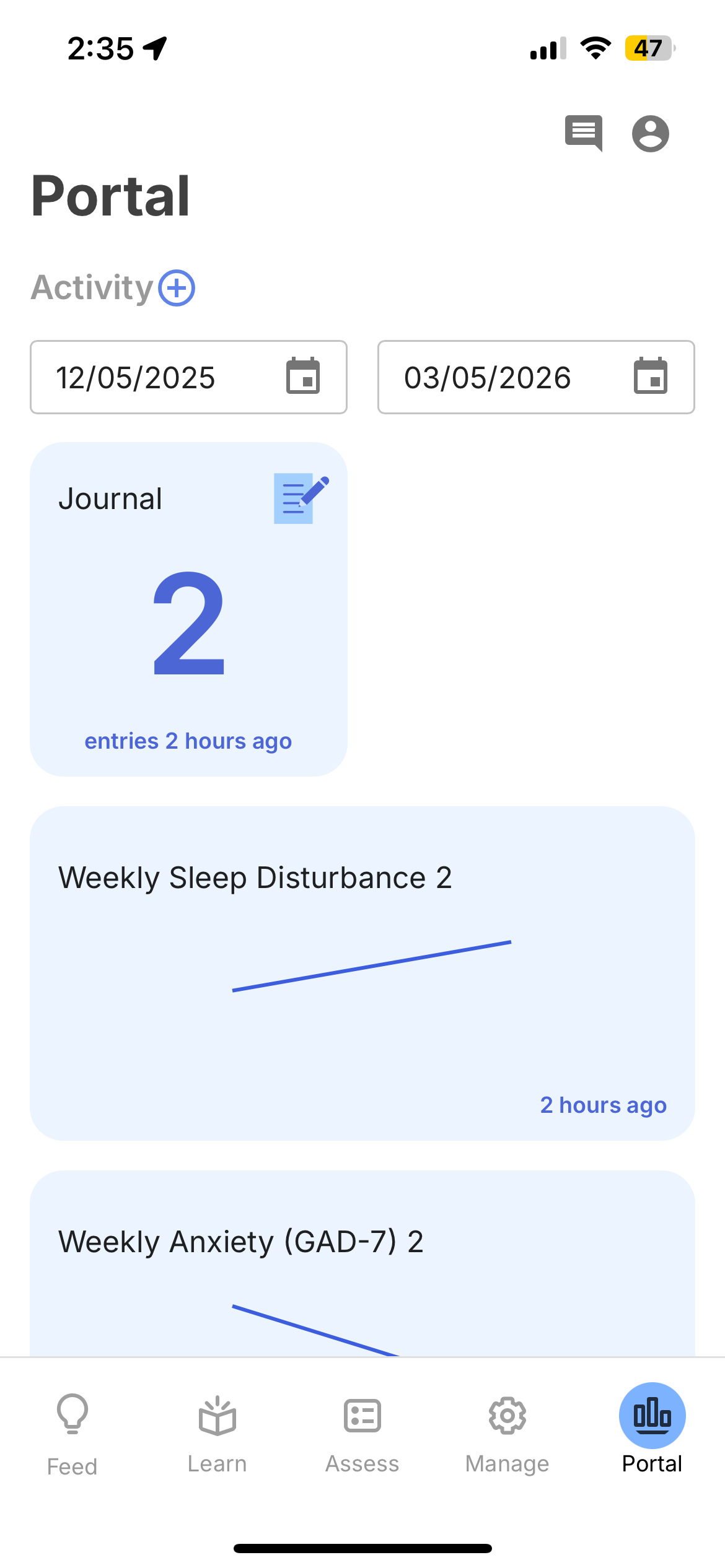
Filtering by Date
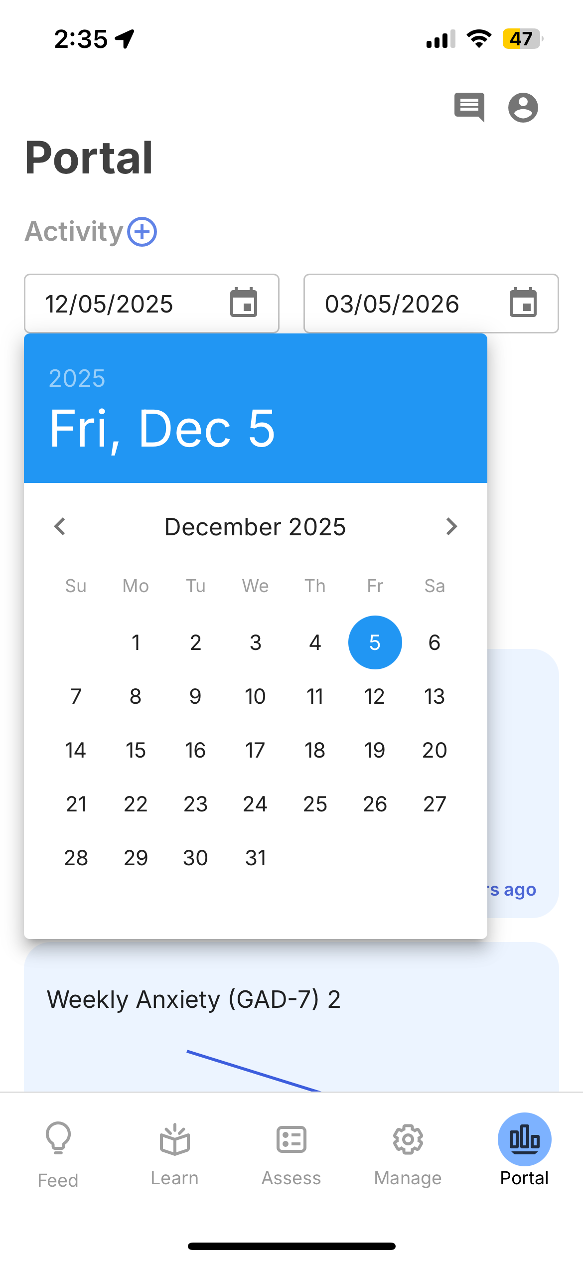
Use the date pickers at the top to set a date range for the data shown. Tap either date to open a calendar and select a new start or end date.
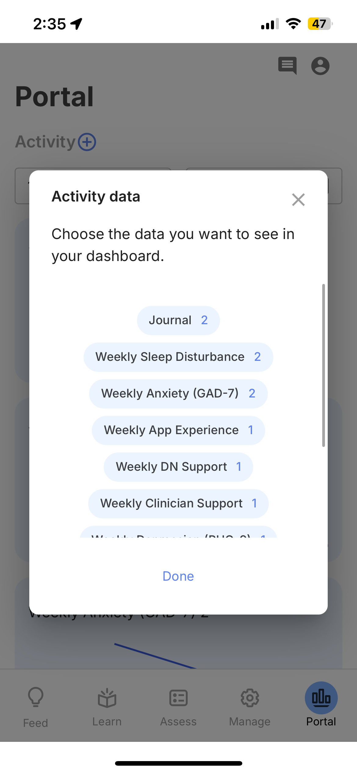
Choosing Which Activities to Show
Tap the (+) button next to "Activity" to open the activity picker. This shows all activities that have collected data for the participant, along with the number of data points for each. Select or deselect activities to control what appears on the Portal.
Viewing Activity Details
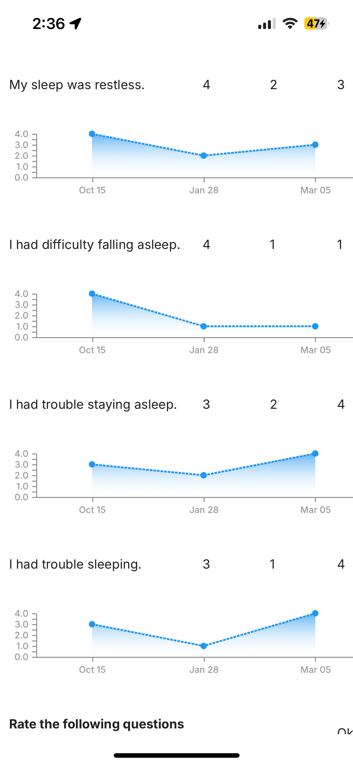
Tap any activity card to see more detail. For surveys, the detail view shows a summary chart of the overall score over time.
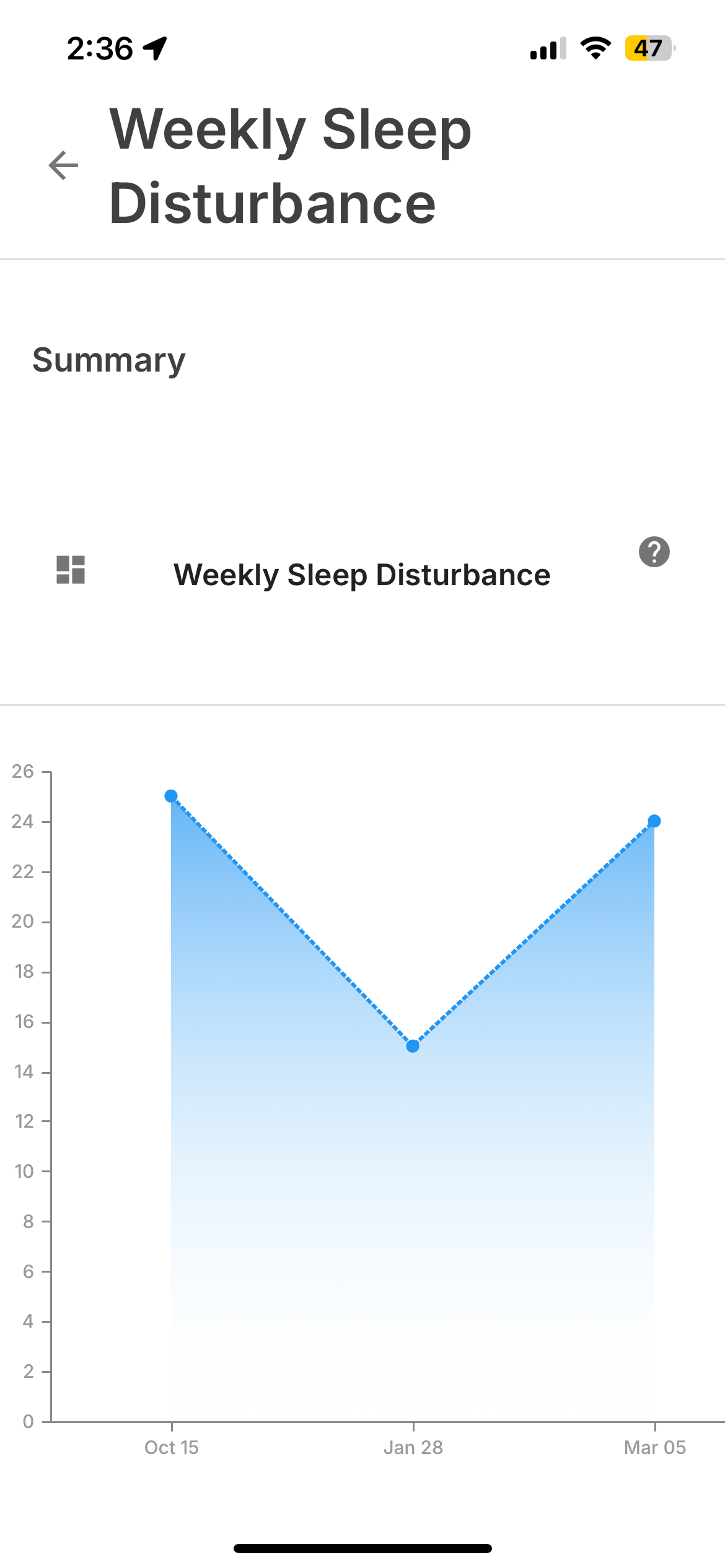
Tap the grid icon in the top left to see individual question-level breakdowns — each question displays its own chart with response values over time, making it easy to identify which specific items are driving changes in the overall score.
Cortex Section
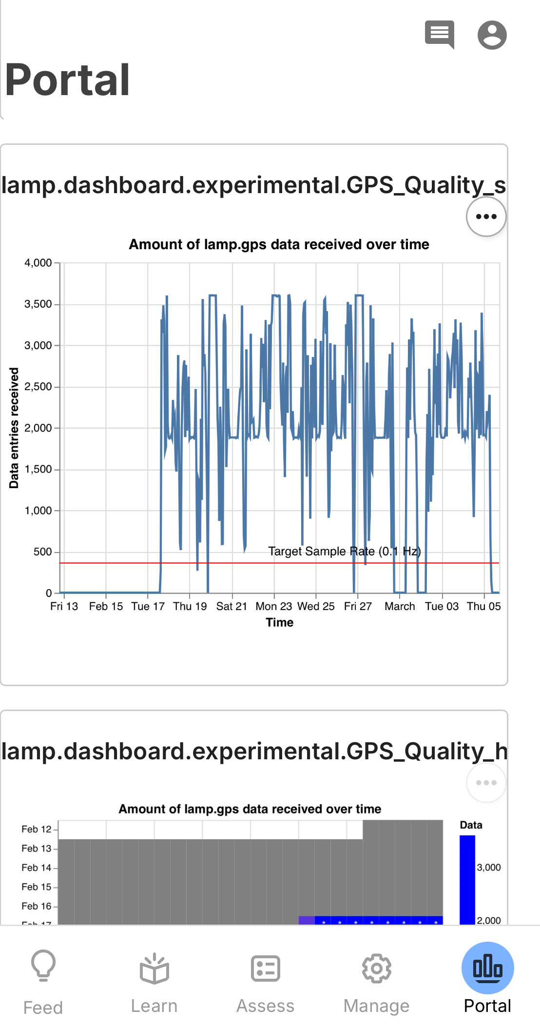
The Cortex section displays visualizations generated by the Cortex data processing pipeline — computed metrics derived from raw sensor data such as GPS and accelerometer.
Tap the (+) button next to "Cortex" to choose which visualizations to display. Available options depend on which Cortex features have been run and attached to the participant.
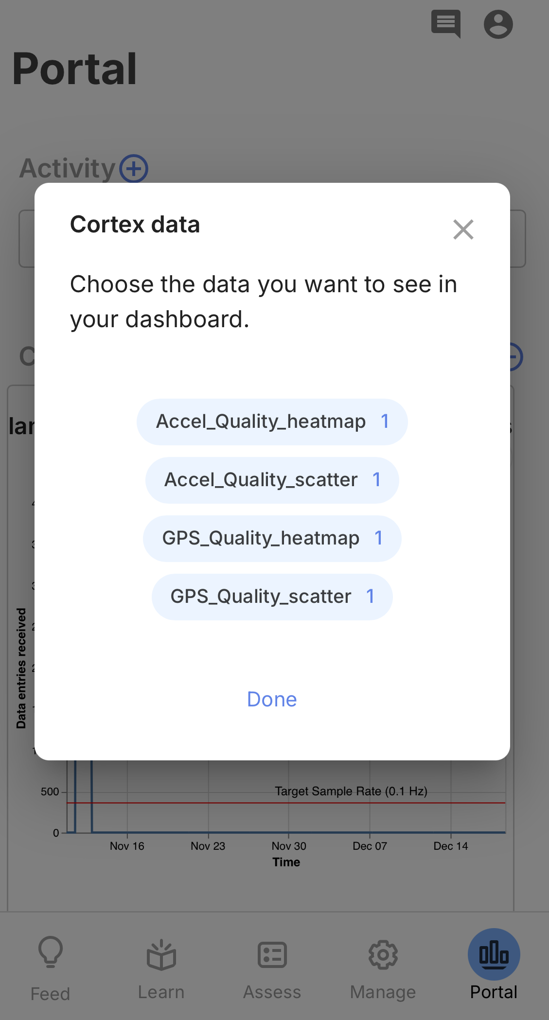
Selected visualizations appear as full-width charts on the Portal. These can include scatter plots, heatmaps, and time-series graphs showing data quality and collection patterns over time.
Clinician View
Both participants and clinicians can view the Portal. Participants see their own data; clinicians can view any participant's Portal through the dashboard by selecting that participant. This provides the same visualizations the participant sees, which can be useful during clinical sessions or study check-ins.